
Digital
An overview of Figma Slots
September 9, 2026 by Stewart Hamilton No Comments | Category Digital Scotland, Scottish Government Design System
Blog by Kaloyan Yordanov, Student placement, Scottish Government Design System.
If you work with reusable components in Figma, you may have run into a familiar problem: the component works well until you need to add, remove or rearrange something that the original structure does not allow.
The usual workaround is to detach the component instance. That gives you freedom, but you lose the link to the main component and any future updates.
Figma’s slots feature gives us another option. Slots create flexible areas inside components where content can be added, removed or changed without detaching the instance. Removing content is another great advantage to slots – as you are not forced to hide content from view, as is the case with components. For design systems, this can make components easier to adapt while keeping them connected to the main source.
Why slots are useful
The main benefit is simple: slots reduce the need to detach components.
Imagine an Accordion component containing six accordion sections. If a design needs seven, the old approach may require detaching the component before adding another section. Once detached, that instance no longer receives updates from the main component.
A slot can turn the Accordion’s content area into a flexible container instead. Designers can add or remove accordion sections while keeping the instance connected. This saves time and reduces the chance of outdated or inconsistent components appearing across designs.
Slots can also guide people towards the right content. Component authors can suggest preferred instances, such as allowing Accordion sections inside an Accordion slot. These act as guardrails rather than hard restrictions, but they make the intended use much clearer, particularly for people who are less familiar with the component.
Another useful feature is the ability to reset only the content inside a slot. Instead of resetting the whole component, you can return one flexible area to its original state.
How to create a slot
Slots must sit inside a component. To create one, select or create a frame inside the component, then choose ‘Convert to slot’ from Figma’s actions menu.
Once created, you can give the slot a clear name and description and configure how it should be used. For example, you can set a minimum or maximum number of layers, suggest preferred components or make the slot empty by default.
Keep the guidance simple. A name such as Accordion content tells people what belongs there without requiring them to understand the component’s internal structure. A short description can explain anything that is not obvious, such as recommended content or limits.
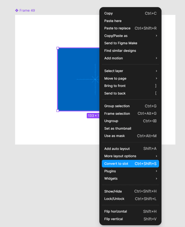
Figure 1: The ‘convert to slot’ option from the Figma actions menu.
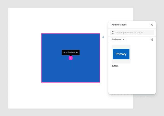
Figure 2: List of component options to choose from when populating a slot.
Using slots in the SGDS Accordion
The Scottish Government Design System (SGDS) Accordion was a strong candidate for slots because it contains a repeated set of accordion sections.
Previously, adding another section meant detaching the Accordion instance first. I updated the component by wrapping the accordion sections inside a slot called Accordion content.
The result is a more flexible component. Designers can now add or remove sections without detaching it, so the component can continue to inherit future updates from the design system. It also makes the structure easier to understand in the layers panel.
This is where slots have the clearest value: they allow a component to stay reusable without making it rigid.
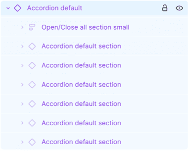
Figure 3: Old implementation of the SGDS Accordion component.
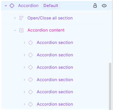
Figure 4: New implementation of the SGDS Accordion component.
Using slots in the SGDS Table
The Table component was more complicated because Figma does not have a perfect native solution for tables.
I explored three approaches. A grid-based version made it easy to add multiple cells, but still required detaching the component for some changes. A slot-based version allowed direct editing without detachment, but adding cells in bulk was less convenient.
The most useful approach combined slots with Figma’s grid auto layout. The table headings and table content became separate slots, while each content row used a grid. This kept the flexibility of slots while allowing users to add or remove multiple cells more efficiently.
It is not a perfect solution. Removing populated columns can still cause cells to wrap and require some manual clean-up. But the component is easier to adapt and remains connected to the parent and will receive cascading updates.
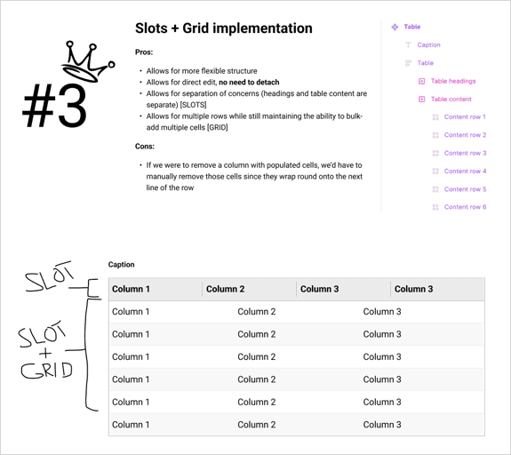
Figure 5: Third solution approach to the table problem.
What to keep in mind
Slots are useful, but they are not a solution for every component.
They cannot be nested directly inside other slots, so very complex structures may need to be broken into smaller components. The guardrails you configure are also not absolute. Figma can warn someone when they go outside the intended limits, but it does not always stop them.
That means slots work best when they are used deliberately. Add them where flexibility solves a real problem, and keep the names, descriptions and suggested content clear enough that someone can understand the component without extra any explanation.
The takeaway
Slots make Figma components more flexible while helping them stay connected to the design system.
For the SGDS Figma Kit, they have been particularly useful for components with repeating or variable content, such as accordions and tables. They reduce the need for detachment, make components easier to adapt and provide useful guardrails for the people using them.
If you maintain a Figma library, it is worth looking at the components people detach most often. Those are likely to be the best candidates for slots.
You can access the Scottish Government Design System Kit at our Figma Community page.
If you have any queries about using kit please contact designsystem@gov.scot
Further reading
Use slots to build flexible components in Figma
How to supercharge your design system with slots
https://www.figma.com/blog/supercharge-your-design-system-with-slots/?fuid=1656753129016631959
Name and organize components
https://help.figma.com/hc/en-us/articles/360038663994-Name-and-organize-components
Slots in Figma: How to name, parameterize, manage, and consume native Figma slots in Welcome
https://design.accor.com/latest/terminology/slots-in-figma-thvkjup6
Implementing Slots in a Figma Library
https://nathanacurtis.substack.com/p/implementing-slots-in-a-figma-library
Figma Slots: The End of Detached Components (And Why Your Design System Will Never Be the Same)
—–
Have you read our Digital Scotland newsletter?
Subscribe to future editions: https://bit.ly/3jlynUs
Tags: Figma, Scottish Government Design System, Slots
 RSS
RSS Email
Email
Leave a comment