
Digital
Moving beyond clear and simple to reach overwhelmed users
July 9, 2026 by deborahamzil No Comments | Category Client communications, Content Design, Social Security Scotland
Sarah Waterfield, Senior Content Designer blogs about using a test and learn approach to improving letters issued by Social Security Scotland.
Imagine you’ve waited months for an important decision. One that will shape your daily life. The process has been long and sometimes difficult: gathering documents, sharing personal health information, asking for help, then the waiting. When the envelope finally lands on the mat, you open the letter and start scanning. Relief, anxiety and frustration swirl as you try to find the information that matters most:
- did you qualify?
- how much will you get?
- what happens next?
This high-stakes moment is what I focused on improving for clients getting their decision letter from Social Security Scotland. My goal was simple: help people understand their decision quickly and clearly. In practice, our long formal letters were difficult to read and left some people unsure what their decision actually was.
To make meaningful change, I needed strong evidence on what would support clients at this difficult moment. I used a test and learn approach to gather that evidence.
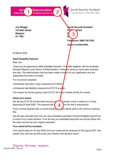
Sample Social Security Scotland decision letter
Understanding why decision letters feel overwhelming
Test and learn starts by understanding the problem.
Research showed that in the first 5 seconds of opening the letter, clients would see a bright pink box with the words “Notice of determination”, our logo and address, but not much else. At such an emotional moment, those first few seconds need to work harder.
I had my first assumption: instead of supporting their understanding, the structure of page 1 was making it harder for clients to recognise their decision.
Analysis like this helped turn assumptions into testable hypotheses:
- more clients will understand their decision if they see it in the first 5 seconds of opening the letter
- clients will accurately understand their payment if shown the amount they’ll see in their bank account
- clients can identify next steps quicker with a simplified layout
And framing assumptions as hypotheses gave me a neutral way to challenge them.
Finding the fastest way to new ideas
The team came together to explore my hypotheses, we ran a sketching session – a collaborative content design technique to generate ideas.
Each sketch explored a different way to meet a top user need. We put aside technical and legal constraints and focused only on the best way to meet the need. With a timer ticking, everyone sketched quickly.
Patterns from these sketches informed the first prototypes, which we used to test our hypotheses with real clients.
How ideas held up against real behaviours
We designed 2 prototypes, each offering a different way to meet the same user needs.
Prototype A kept a similar structure to the current letter while Prototype B incorporated the patterns from sketching into a simplified layout. By organising information around key tasks, prioritising what mattered most on the first page and cutting repetition, the design was shorter and clearer as a natural consequence of meeting user needs.
Testing prototypes side by side is not about picking a winner, it’s about learning which design decisions are more effective in meeting user needs and to give us the evidence we need to bring stakeholders with us.
When testing Prototype A, we saw moments of panic as clients flicked back and forth between pages trying to match information up. Repeated payment figures, phone numbers and headings pushed clients into comparing and checking details, which added pressure at an already stressful moment. They lost their place, pages fell to the floor and their confidence dipped.
Prototype B produced a noticeably different response. Clients moved through it more calmly, found the main points faster and understood what to do next without feeling overloaded.
Each round of testing gave us practical evidence about which patterns supported understanding and which got in the way. These insights shaped what we refined next, creating a steady feedback loop grounded in real user behaviour.
Bringing evidence back to the business
This evidence base became the thing that brought everyone together and made collaboration easier. Instead of approaching requirements separately, we could look at the same evidence and see how different needs could work together in the design.
The pink box is a good example of this. We hypothesised more clients would understand their decision if they saw it in the first 5 seconds. When evidence showed the pink box stopped this from happening, it opened up discussions with policy and legal colleagues. They told us the pink box was a standard pattern to make sure the client knew this was their decision letter. With this shared understanding, we could collaborate to design for the user need in a way that still met their requirements.
In the new version, the decision is at the top in a big bold headline. Underneath, a sentence clearly identifies the letter as the notice of determination and explains what it is. Our user research colleagues then tested the design with users, fully validating that we had met this user need. All of them immediately recognised their decision, understood it and felt reassured. As one client put it: “anxiety levels lifted”.
The test and learn approach reminded us that user needs do not belong to any one profession. They give everyone a shared reference point for decisions that work in the real world.
Key takeaways for your next project
- Understand the problem.
- Turn assumptions into hypotheses for a safe way to find out what you don’t know.
- Prototype ideas early to explore different options without taking big risks.
- Watch real behaviour to understand what actually works for users, not what you expect to work.
- Share what you learn to collaborate and make decisions together with stakeholders.
Together these steps gave us a reliable way to transform a complex letter and reshape an important experience for clients. Test and learn helped us make clear decisions, reduce risk and ultimately deliver something that works better for the people who rely on it.
Further reading
Tags: content design, Social Security Scotland
 RSS
RSS Email
Email
Leave a comment