Digital
Content Rally
August 4, 2015 by Jono Ellis No Comments | Category Digital Public Services, mygov.scot

This is a post by Jono Ellis, our Social Media Manager
It’s been a busy few weeks here in the mygov.scot team. One of my personal highlights of our recent work was the Content Rally where everyone, irrespective of discipline, took on the role of Content Designer.
To explain more about the Content Rally here are some thoughts from Angela Morrison, one of our Content Designers.
Why did we hold a Content Rally?
Working in a busy environment it can be hard to find time to step back and think about how we’re working. The Content Rally came about from a need for us to take stock of how our publishing platform works, what our Content Team processes are and plan some improvements. It happened at a time where there was a lot of content requiring processing at once and it helped us with a big deadline. It was definitely successful in importing lots of content, giving everyone insight into how the platform works and bringing to the surface some bugs and future feature requirements. Content Designers have a different view on how the platform works to people with other specialisms and those other ideas are vital on how to improve the platform.
Content is everyone’s responsibility, not just content designers. Content has a very long process – it starts with Stakeholder Managers engaging with organisations to get them involved. Developers are involved in the creation of a platform that is easy to use. UX ensures that the interaction of users with the content (and the user’s journey though the content) is optimised. We are all responsible – if any of these steps don’t work it’s a barrier for good content being on the site.
What happened after the Content Rally content was uploaded?
Participation in the Content Rally was entirely voluntary – we asked for volunteers and had a brilliant response. People were really enthusiastic! Although everyone has their specific roles most of our colleagues are multi-skilled and enjoyed taking part in the process of page creation and content upload.
Our Content Team are used to working with the platform and are used to experiencing changes as it continues to develop. Users during the Content Rally saw things that we had a workaround for as bugs. It is important that when we have new people coming on board to use the platform that we can spend time training on content design, not on process of upload and the experience of content rally users brought clarity to some of the gaps and bugs that the tool has.
The next step was to make sense of feedback on both the platform and the process at a sense-making workshop which was ran by Kate, one of our user researchers. We started by collating our thoughts, we took a step back and then grouped the data, then formed some actions. This was initially done by everyone who’d been involved in the Content Rally. The core user group of content designers then worked with user research and user experience leads to co-design some prototypes of how we’d like the platform to look in the future. This all felt like it took a long time but it was very much needed and it ultimately felt very worthwhile.
As an aside, our process for using the publishing platform only had one issue due to this higher volume of usage – one a few occasions content was duplicated as two people worked on uploading the same piece of content. This came about due to the speed that people were working and the short time delay between creating a new page and it appearing in search. Again, something else to be rolled into our improvement plan.
For the content which had been uploaded by the team, the content designers followed up by editing and peer-reviewing. Some of this work was to include internal links (which couldn’t be done until all of the content had been uploaded).
It was good to have a task outwith our usual roles, putting the team in a different situation. I really enjoyed seeing people discussing and working towards the same goal. Everyone did a great job and overall felt that the platform was performing well.

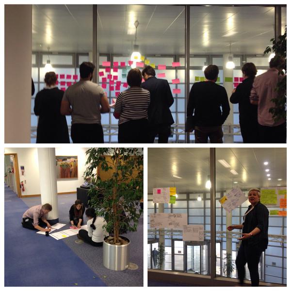
Sensemaking workshop – photos by Kate Saunderson
Kate Saunderson, one of our User Researchers, explains the work that followed on from the Content Rally.
As well as uploading content, what were the other benefits of the Content Rally?
The productive aspect of the content drive was followed up with productive conversations about how to refine the tool. This started with a 2 hour sensemaking workshop, held on a Monday morning. People were fresh and positive – it was a good experience as a facilitator and people seemed to get a lot out of it.
- Getting people to experience using (and really engage with) the platform
- It’s hard to have empathy for users of a tool if you have never used the tool for yourself.
- Understand issues with the journey of uploading content
- The focus group reviewing the publishing platform have been finding it hard to drive some improvements forward. New users gave the User Research Team a chance to identify something more than just some issues – we could use the task led situation to really find out which issues should be a priority by capturing the experience of the users.
- Asking the question “How do we converse around the publishing platform?”
- By creating an opportunity for interaction with the platform we could facilitate conversation. It’s unusual to have design and use in the same place and that can make it harder to articulate to colleagues about why it is that a tool isn’t quite doing what you need. By creating an opportunity for a neutral interaction – where designers and users are taking part in a shared task – it facilitates conversations. These conversations help bridge the gap between the design and development teams and the Content Team (as the end users), and lets everyone see what works and what doesn’t. Mapping the user journey helped illustrate the issues and aided understanding by giving repeated changes to converse – the team refined their understanding and got comfortable talking about what worked and what they would like to see in the future. 6 different disciplines brought 6 different sets of knowings and these were all documented by Chay’s user journey map.
After mapping the user journey came co-design.
The co-design process took the efforts of the Content Rally and took them one step further in a co-design workshop which we’ll document further in the future. As an overview 3 teams of 5 people from the team were given 2 hours to come up with 100 solutions and ideas which they thought could make the publishing platform better. People then broke into teams and then created wireframes or prototypes of their ideas. The ideas which came about were remarkably similar, showing just how aligned the team are in their thoughts on the direction of where we should be heading with the publishing platform.
Co-design sessions are when a group of people break something into pieces, explore the issues, and participate in designing their ideal version of that thing. The publishing platform could evolve into a Frankenstein’s Monster – it’s been implemented on a drip-feed system and although design has happened at each stage of the process it hasn’t been possible to manage all of those smaller designs in the true, overarching “Research, Design, Develop” process. Some of the issues raised through mapping the user journey and the co-design were already represented as cards on our horizon board. We held meetings with our business analysts to compare with these existing stories and to start the process of discussing some of the bigger issues where no simple solution can be implemented in one go. Co-design has let our Content Team (as end users) push their ideas of how they feel the platform should work further on in the thought process before handing these ideas to the UX and Design Team.
In terms of user research/engagement, what will you do next time there’s a Content Rally?
The exploration of issues and the conversations around those issues are valuable to everyone in the team but are most useful to those using the platform. Because of this, next time around we will extend the invitation to users outside mygov.scot. Having people outside the team will have a huge benefit as it brings even more experience but there is trust required for this, to open up existing work, and we need to be open to people seeing our process. This can be humbling and scary but we have the benefit of already having worked through the process once and so we will be in the right place to be more open next time.
Our Creative Lead Chay Nicholson explains his role in creating the user journey map, helping to turn feedback into actions.
How did you go about visualising the feedback?
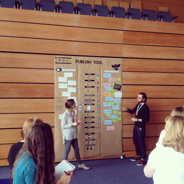
People get post-it note blindness so my role was to visualise the feedback in a more meaningful way (more than just a row of post-its). Credit goes to Rachel and the Content Team for their work categorising and grouping the feedback. I shut myself off from the detail of the feedback and instead listened whilst the categorising and grouping was taking place, picking up on the high level ideas. To me the interesting part was to create the canvas to represent each step with a visual representation. To the left was space for observations and comments, to the right there was space for actions. By showing the steps it gives something for people to look at, to ask questions about and to comment on. It was pinned up on the wall and will allow us to check off actions.

The finished visualisation – photo by Kate Saunderson
To close, one of our Content Designers Mairead Rogers shares her thoughts on the lasting effects of the content rally.
For me, there were two things that particularly stood out. One was the camaraderie – everyone is already working towards a shared goal, but in this instance it was a shared task. We were all in the same boat and it was ace watching everyone share tips, ask questions and generally get stuck in to uploading content! Secondly, I felt it was a real example of us ‘putting our money where our mouth is’ and keeping user focus at the heart of everything we’re doing. The mygov.scot website seeks to put users first. The Content Rally and the co-design process afterwards seemed to take this a step further. It sought to make sure that behind the scenes the publishing platform itself was user focused, helping the Content Team concentrate on content – not how it’s uploaded. What better way to ensure we put users first that by having everyone walk in our shoes and become Content Designers for a couple of days – the publishing platform ‘users’?
We’ll be sharing updates on these features, and much more on social, so follow the team via @mygovscot on Twitter for more updates. Want to comment? Let us know below!
Tags: content

Leave a comment