Digital
Design style guide
October 26, 2015 by craigmilligan No Comments | Category Digital Public Services, mygov.scot
This is a post by Chay Nicholson, our Creative Lead.
The first pass of our Design style guide has just been published to the mygov.scot resources site. The Design style guide aims to provide guidance to developers and designers in producing digital services for or aligned with mygov.scot.
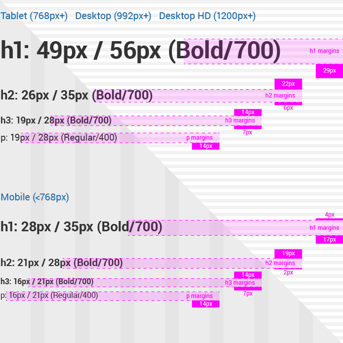
The guide covers design thinking and approach, as well as providing inline working examples of components. In this sense it is an amalgamation of design elements and style guide – putting the what, and the why in the same place. By providing the context around decisions that we have made, we can hopefully help designers and developers come up with solutions in situations where there may not be a pre-prescribed solution. An example of this is where it may be necessary to fine-tune spacing to compensate for the css interpretation of line-height.

Some fine-tuning of text margins is sometimes required to compensate for the css interpretation of line-height, which takes its reference from the centre line rather than the baseline of the type.
There’s more to come, but for the time-being, we have focused on The grid, Typography and Link/button language:
The grid – The grid is the backbone of every site; it informs layout and provides a visual framework for layout and vertical rhythm. This section of the Design style guide is where you can read about everything grid-related.
Typography – Good legible type facilitates quick and easy digestion of information. There are many factors that contribute to good typography and good readability. It’s not just a pretty face.
Link/button language – The creation of buttons and links is easy… until you realise that users don’t interact with them in the way that you anticipated. Over the coming weeks we’ll be sharing some thoughts on this and how others can learn from our findings.
There’s lots still to come: Colour palette; Refinements to list items, accordions and tabs; Further detail around link and button language elements; Additional elements as they are developed.
We’re not there yet, there are some gaps to fill and a few creases to iron out. With that in mind, take a look at the guide and let us know what you think.
We’ll be sharing updates on this, and much more on social, so follow the team via @mygovscot on Twitter for more updates. Want to comment? Get in touch below!
Tags: Design and User Experience

Leave a comment