
Digital
Designing form elements to help users
April 24, 2017 by Jono Ellis 1 Comment | Category Digital Public Services, mygov.scot
This is a blog post by Tim McGraw, one of our user experience designers.
When building an online transactional service, forms are crucial. As with everything we do, it’s worth doing the hard work to make forms easy for the user. We aim to harness the breadth of talent and experience across the public sector in Scotland and beyond to feed into the standards and guidance we produce. We want to help others avoid mistakes already made and learned from in the past. Making a form easy to use means that users can fill it in more accurately and quickly, which reduces the time needed to process it. To help service designers across the Scottish public sector create consistent and usable services we have developed a guide for forms.
Form guide
Guidance on how to build forms is a massive topic. To begin with we have provided guidance on the actual elements of a form. These elements provide a foundation to start from.
Whether you are designing a form or designing a service:
- know your users needs
- know the details you need from the user that help you to fulfill those needs
Once you know this you can establish the questions that you need to ask. It’s important to design the form not the aesthetic. We have collaborated on form design with Disclosure Scotland and the Digital Ecosystem Unit, giving us some practical examples to share – we hope that this helps service designers quickly create responsive form elements and interactions which follow a consistent design pattern, allowing more time to be spent on elements that are individual to the service. These guidelines are targeted at teams working in and on behalf of government in Scotland, and can be used for discovery, alpha or beta services.
Form elements
The fields are where most focus is drawn on forms. However, while developing the style guide it highlighted how many other elements are key to a great user experience. Labelling, messaging, indicators and actions all work with the form fields to create the overall look and feel of the form.
Here are just some of the elements covered in the guide:
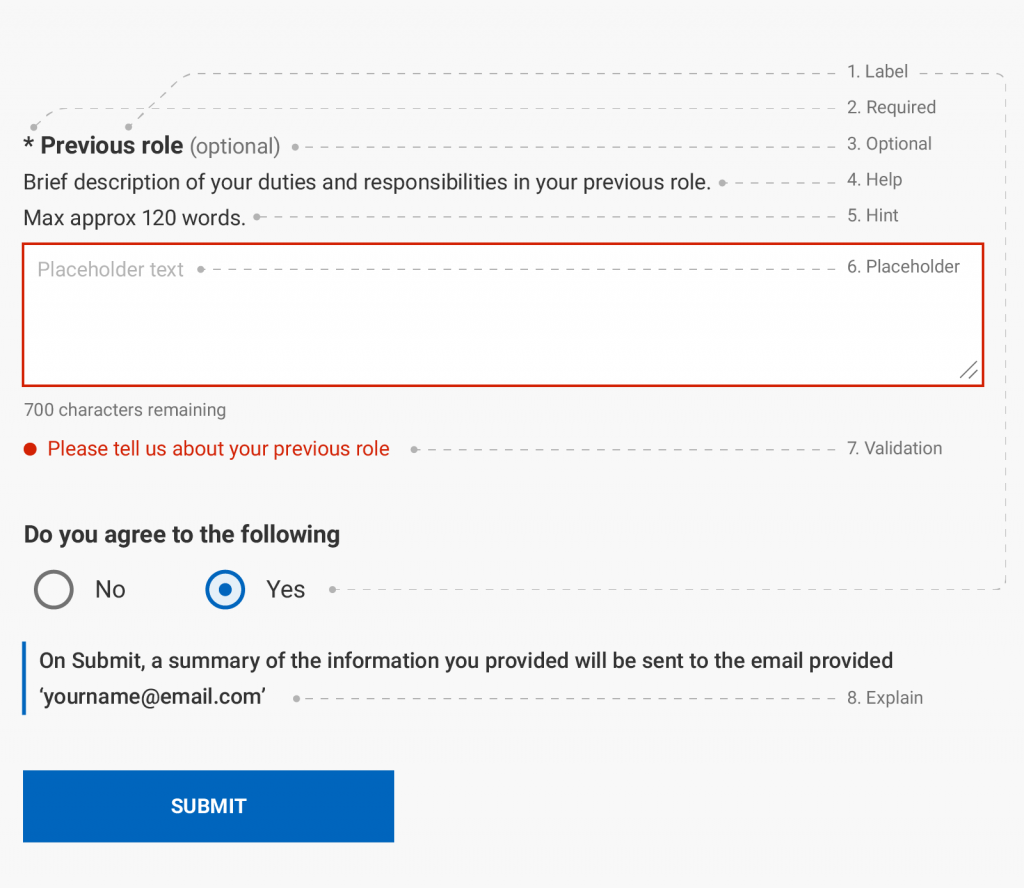
There are more than 45 different elements that can go into making up a form in different permutations. It is important that forms across Scottish Government services have consistency – to that end our guide attempts to steer developers and designers through the complex process by showing best practice, standards and guidelines for each individual element.
Helping the user
To mitigate against user mistakes, we need to help (not hinder) the user. We do this by:
- Labelling
Labels and supporting text need to be clear and precise. - Hinting
If there’s a specific format to use then give a “hint” to help the user to get it right first time. - Validating
Keep users focused by performing quick checks and giving immediate feedback – for example, numbers fields shouldn’t validate if the user has included a letter. - Alerting
Too many alerts can be frustrating, but alerts should be used for common mistakes missed in the validation step (e.g. start and end dates being the same). - Feeding back
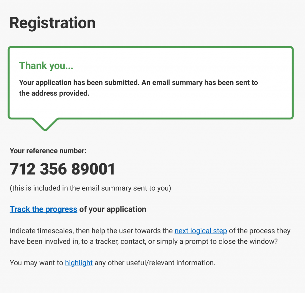
- Success messages reassure users, but they can be more practical than that. Include a review stage for users to double check for mistakes, provide a reference number for submission follow-up and suggest ways for the user to continue their journey.
- Error messages are the last line of defence to stop users from entering the wrong information. Error messages must be clear, easy to understand, indicate how to fix the problem and provide an easy path to fixing the problem.
A look at messaging
The form elements used for messaging are often the hardest to get right. When thinking of form messaging you probably think of a massive box at the top of the page, flashing red, saying “ERROR!”.
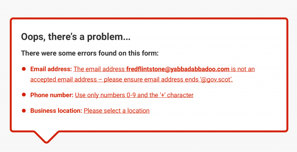
Messaging can be more subtle than that. We try to create sites and services with an atmosphere of encouragement and safety… but typical error messages can do quite the opposite, adding confusion, unease or anxiety. Although we still use big red boxes, we try to minimise the need for them by catching errors either before or when they occur. Empathy is key to form design. Users make mistakes. It is not their fault, it’s ours as the form designer; we must remember that users may be under external pressures that make the from harder to fill in. An approach Caroline Jarret suggests is to imagine a user trying to fill in a form whilst talking on the phone and typing with one hand.
There are several different techniques we use to try to create a more nurturing and understanding user interface: we try to accentuate positive messaging patterns.
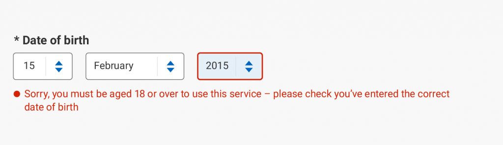
In this example we first apologise (this takes the blame away from the user), we then tell the user what is wrong and lastly put the user’s mind at rest by suggesting that this is a common error that can easily be fixed.
When the user makes a mistake
- Remember – Users can likely only access these services through this form.
- Take responsibility – Accusing users of mistakes when it is you that have made the mistake in the first place can lead to distrust. “If people mistrust you, they’ll steer clear unless the risk/reward ratio is tempting.” (Conversion Conference Blog).
- Reassure – Bad experiences can lead to users not receiving help when they most need it.
It all comes down to trying to help the users make fewer mistakes and, when the inevitable does happen, make it as easy as possible for them to correct them.
User testing
We have carried out user testing on our form elements by creating a prototype and inviting a wide variety of users to try out the elements for themselves. So far we have had two rounds of user testing; one focused on mobile devices and responsive design, the other focused on desktop devices. With the help of our user research team we have managed to make some important discoveries that has enhanced the usability of the form elements.
Next steps
We will improve these guidelines as we make new discoveries and overcome newfound challenges. In the coming year, we aim to give comprehensive information on building forms through more guidance and blog posts. The next stage of developing the form elements is to user test with a focus on assistive technologies and are in the process of recruiting users. We have already moved into the second phase of our form guide too, which includes the design of multi page forms and user interaction (such as conditional fields). We will again be hoping to work with Disclosure Scotland and others to help develop these guidelines further so would love to hear your opinion in the comments below.
Tags: form design, forms, service design
 RSS
RSS Email
Email
Useful stuff Tim!