Digital
Drawing is designing
October 6, 2025 by deborahamzil No Comments | Category Content Design, Design, Digital, Scottish Government, Social Security Scotland
Guest blog post by Andy Robertson, Senior Content Designer in Social Security Scotland.
In the age of shiny new Artificial Intelligence (AI) tools, I’m making the case for pen and paper. As a senior content designer in government, here’s how I use my drawing skills.
I love to draw
Some of my strongest memories as a kid are of drawing. Especially my mum’s unconditionally positive reactions. Drawing was the first thing I felt good at.
I was lucky to have several amazing art teachers at school. And a dad who told me about a place called art school I could go to after high school.
Drawing is how I found my place in the world in my teens. It’s how I made money after I graduated in textile design from The Glasgow School of Art. It’s helped me grieve. It’s how I uncover ideas for designing public services.
AI feels like de-skilling
“I want AI to do my laundry and dishes so that I can do art and writing, not for AI to do my art and writing so that I can do my laundry and dishes.”
Author Joanna Maciejewska
Instead of asking AI for help with a problem, here’s when I reach for the pen and paper.
I need space
The past few months I’ve been designing content for a complex social security product. I’m listening to a lot of different people’s answers to a problem we’re solving. I’m seeking inspiration from peers and co-designing with different people.
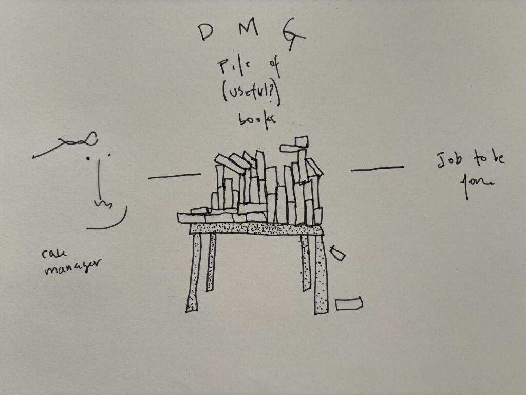
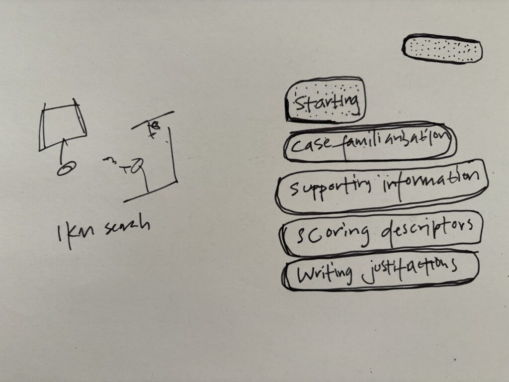
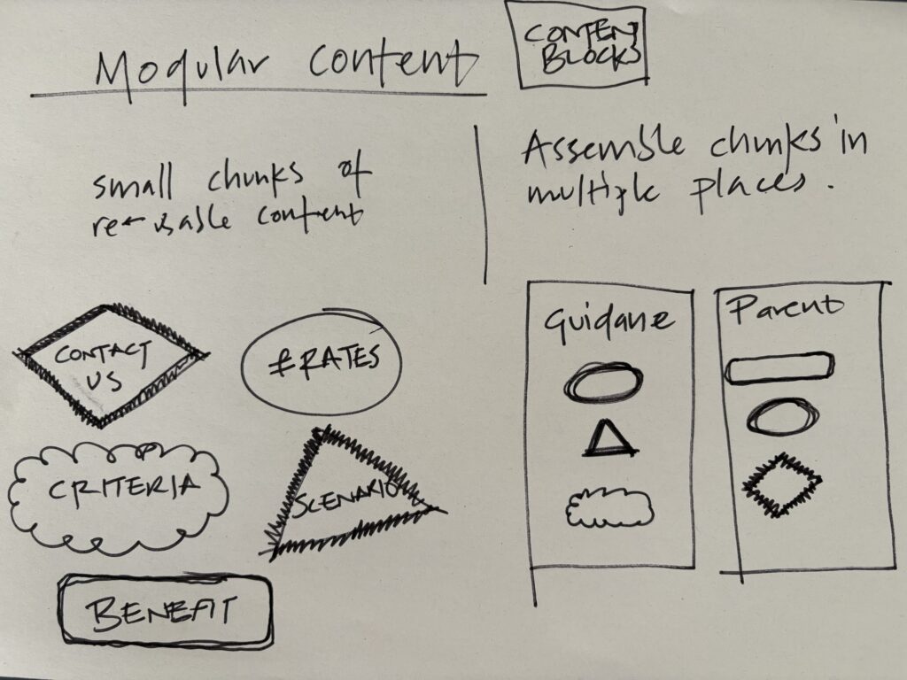
This amount of information is hard to boil down into ideas using words. Drawing helps me distil the voices of others into more defined ideas.
Light-footed prototyping
High-fidelity mock-ups can give the wrong impression to collaborators. That the idea is ‘done’. And the decisions have been made.
Staying lo-fi for longer helps keep collaborators or testing participants involved. Sometimes an option we’re testing isn’t working. Sketching out a new idea in the moment can clarify their feedback and create new ideas to test. I don’t have time to fire up figma and create something new in that moment.
Sharing understanding
I’m not the best verbal communicator. I’m dyslexic, so learning by reading or listening guarantees I miss things. A visual confirmation works well for me.
This clarification works in two directions:
I don’t understand what someone is saying. I can draw what they describe and ask, ‘is this what you mean?’
My verbal communication isn’t landing. I can show them a sketch and ask ‘do you see what I mean?’
Thinking away from the screen
Scottish folk might recognise this feeling after the long winter. Usually in about March, the sun is out for the first time in months. When the sunlight hits my face, I feel this ripple of relief. There’s light again.
Too long staring at the screen without drawing, and I get that ripple when I put pen to paper. Joy.
Basic shapes
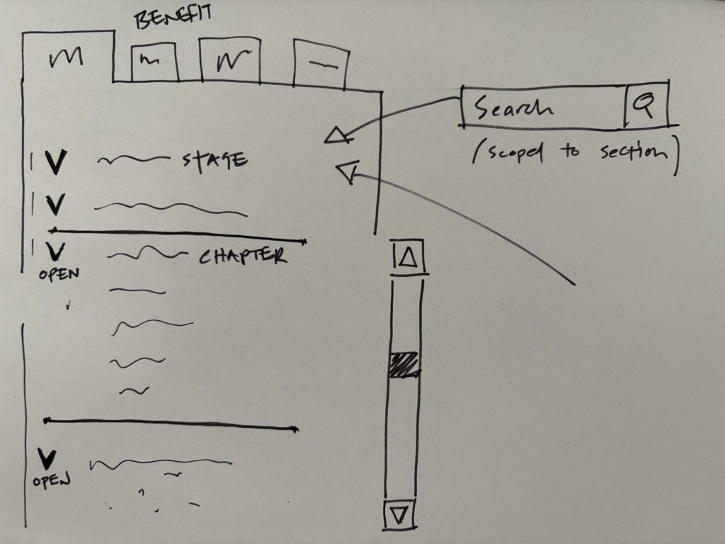
It’s dead easy to sketch user interface ideas with these basic shapes:
- lines for text
- squares for containers, buttons or images
- circles for controls and icons
- ovals for speech bubbles or rounded buttons
- triangles for arrows
Have a go
We’re very quick to dismiss our creativity. If you want to try sketching here are my quick tips:
- start with whatever you already have (my favourites are cheap biros and recycled printer paper)
- it doesn’t need to be pretty, it just needs to communicate your idea
Try it.
Tags: content design, digital, digital public services, Social Security Scotland


Leave a comment