
Digital
Improving our guide page navigation
September 15, 2016 by Jono Ellis 2 Comments | Category Digital Public Services, mygov.scot
This is a blog post by Chay Nicholson, creative lead on the MyGov programme.
In our latest release of the mygov.scot site you might have noticed our guides look a little different. We have changed the way navigation is displayed on guide pages following a recent round of user testing. We felt that the links to the pages of the guide had too much prominence on desktop and tablet views. This meant that on smaller screens people weren’t seeing the content further down the page (below the fold) when they clicked on the sub-navigation.
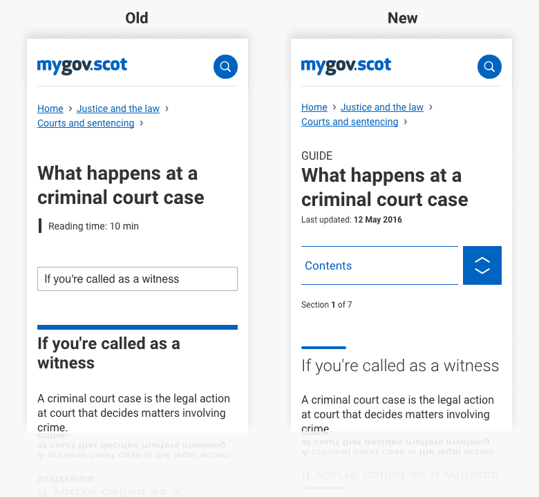
Examples of the guide page changes for mobile
On mobile, we have addressed an additional issue in that the sub-navigation was styled by the default browser dropdown menu formatting. For many users, we felt that this was fine but in Chrome, for example, the formatting was too subtle and some users were missing navigational cues. We learn a lot from the on-page feedback boxes on each page and some of the comments in the feedback suggested some users hadn’t seen other pages within a guide. To address this, we’ve created a custom dropdown element which reuses elements from our work on beta.gov.scot.
Building on this, we have introduced new text for smaller screen sizes stating which page a user is on: “Section 1 of 4” and placed the label “Guide” above the title. Together this sets out where you are and what else is to come. As users scroll, sticky content is now also added to the top of the screen to give quick options to navigate to other sections of the guide.
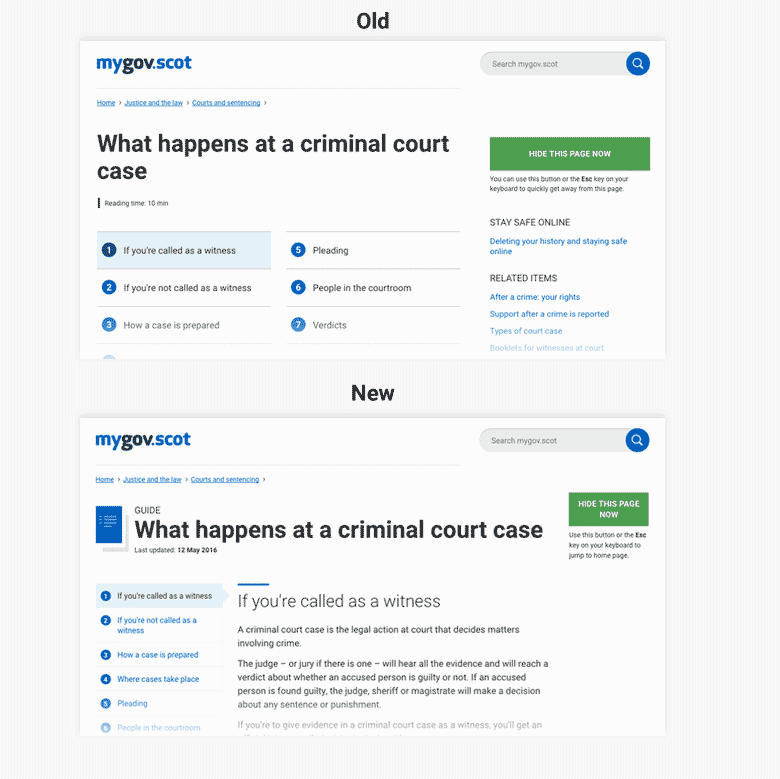
Examples of guide pages before and after changes were made. Main pane content sits much higher up the page now.
The other changes we’ve made include:
- Added in “Previous” and “Next” page labels to links at bottom of page
- Moving our list of related items away from the right-hand column to the bottom, below the article – we know our users tend to scroll through content and this puts the links right where they are when they get to the foot of the page (removing the need to scroll back up)
- We’ve added the sticky header for desktop users
- For desktop/tablet users, as well as the existing label, we have introduced an icon. We are constantly trying to maintain the balance between keeping the site simple without letting users think that the site is bland – subtle graphics help with this, while also making it easier for users to distinguish between different types of content.
- We have replaced our “Reading time” field with a new “Last updated” so that users know how up to date information is (we like reading time but our user research has shown mixed results for something taking up prime screen real-estate)
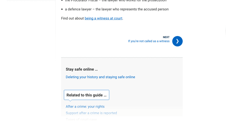
Related information now sits below content on guide pages. We’ll be tracking how this performs against it’s previous right column position
These changes are, taken individually, quite minor but collectively they significantly improve our guides. We adopt a ‘mobile first’ approach – which means we work out how to best serve the needs of users who are using smaller devices, and then we work up from this, adding additional features/styling for viewports that allow. These changes will have the biggest impact for mobile users and for 1024 x 768px displays.
Nothing has changed for our content designers or their process – we have responded to user research and delivered these benefits straight to the user without making changes to the back-end. Our content designers didn’t need to make any changes to existing guides within Rubric, our publishing platform, which means they can concentrate on writing great content!
Let us know what you think.
Keep up to date by keeping an eye on our roadmap and following our updates on this blog and on Twitter.
Improvements look good Chay.
Only constructive comment from me is on the word ‘Guide’ above the title. Not sure it adds anything.
Thanks Paula. The reason we have included ‘Guide’ above the title is to help users understand that there is more closely related content beyond the page they are reading, as well as helping to distinguish between different types of content within search and browse (an enhancement which will be added soon). We received several feedback posts which suggested users weren’t aware there was more relevant content beyond the page they were on. This was particularly a problem on mobile (phone) devices which accounts for 40% of mygov.scot traffic. As mygov.scot matures a greater amount of traffic should come from verbal referrals… ‘There’s this really handy guide to starting a business on mygov.scot’. So with that in mind, we feel the labels will help tackle link blindness, and assist findability.