Digital
Prototyping a life events model for mygov.scot
March 23, 2016 by Scott McLear No Comments | Category Digital Public Services, Digital Scotland, mygov.scot

This is a blog post by the mygov.scot team.
life event. noun. a major event that changes a person’s status or circumstances, such as giving birth, getting married, getting divorced, dealing with the death of spouse or losing a job. Life events are often discussed in terms of stress.
Our team has been exploring how a life event model could help improve our product and help meet the needs of users at common points in their lives.
Last year we co-designed domestic abuse content with Scottish Women’s Aid to help people report domestic abuse and find organisations that offer emotional support and practical advice. Usability testing showed we need to get better at joining this type of information up with other sections of the site (e.g. ‘emergency housing’ and ‘help with benefits and childcare’). I’s simple to find the information you know you are looking for… but what about the things you don’t know you need? When something unexpected or life-changing happens we want to surface the right information as quickly and easily as possible.
The landscape of sites (government, public sector, private sector and third sector) that citizens use to get information for any one life event can be overwhelming. Our goal is to pull together information and links in a way which is meaningful and helpful, aiding users as their needs unfold.
Initial brainstorming from a cross-discipline team covered life events from having a baby to emigrating and what a journey currently looks like across multiple websites. A sub team has been working on a prototype for how changes to mygov.scot’s design and information architecture could be used to present one life event. This will allow us to better utilise data to inform, group, deliver and measure these complex journeys in order to create a better experience for users by joining up public services.

Life events, and specifically relationship breakdown, are well-researched topics, so our first step was to look at what research is already out there that could help us understand the needs of potential users. We first identified the specific groups of people who might be confronted with separation from a partner – people who are cohabiting, married or in a civil partnership. Our desk research explored the following themes:
- Stages of relationship breakdown
- The role of online information and support
- Areas where support is needed for people experiencing a relationship breakdown
- The need for a joined up approach to support
Following this, we ran a 2hr session with citizens who had been through a separation, to understand their experiences and map their needs. We’ll use this research to inform the next phase of content planning.
Understanding our users
When planning and designing content for mygov.scot, one of our biggest challenges is understanding the context of why someone is looking for information.
For example, we know from our data review that ‘divorce’ is a popular search term. When users know what they’re looking for, we can help them make informed decisions to complete their task. But as our discovery has revealed, it’s likely there are other things a person may need support with:
- Looking for ways to help with a sudden drop in household income (e.g. applying for a benefit, looking for a job or getting help with debt)
- Speaking to a solicitor and worrying about the legal fees
- Considering leaving an abusive relationship
- Looking for a new place to stay (over half of all homeless applications in 2014 to 2015 were due to a relationship breakdown or being asked to leave, according to Shelter Scotland)
Using data to identify user needs
As 80% of traffic to mygov.scot comes from organic search, we know that our content for life events needs to be focused on what users are searching for based on the terms they use to search and must be discoverable in major search engines, so we started the analytics research for life events with a simple search.
We searched for ‘relationship breakdown’ to see what information users would find right now, and which websites they would find it on. Using this search as a starting point, we were able to identify the top results from public and third sector websites, and look more closely at the search queries that are driving traffic to them.
To understand the bigger picture of search traffic to these sites, we put the top results into Google’s Keyword Planner and looked at keyword ideas (search terms) and their average monthly search volumes. Exporting the data to Google Sheets allowed us to group search terms into common themes and sort by their search demand (average monthly search volume) – removing search terms that didn’t meet our demand threshold.
The output of this process was a list of over 600 search terms, each receiving between 140 and 27,000 monthly searches on average, categorised into roughly 20 themes. Using Tableau we visualised the data in a treemap.
The research gave us insight into common user needs that might not have initially been associated with relationship breakdown, for example ‘how does a relationship breakdown affect my pension, will, or benefits?’. The treemap clearly presents the breadth of topics and content items needed to meet user needs for this life event. Using real search data also gives us a way of focusing and prioritising content for our users, based on actual demand.
Designing the prototype
Predominantly users coming from organic search will be arriving on pages deep within the site. In our approach to design we focussed on these deeper landing pages. As 60% of traffic is from mobile and tablet devices (a figure which is increasing) these deeper pages are also where it becomes a challenge to design for devices with limited screen width.
It is typical behaviour for sidebar content to drop to the bottom of the page when viewed on mobile – this is a sensible way to handle secondary information. However, in the case of life events, we are proposing that we want to draw more attention to content which we regard as integral to that event and we need to handle this without tripping up the user.
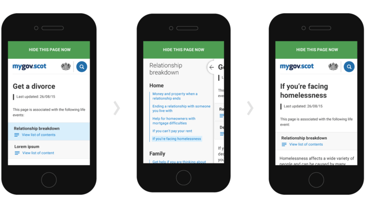
Retaining the current page categorisation for the prototype allows pages to be tagged as being a potential part of a particular life event, or even linked to multiple events. For the prototype these life events are represented as expandable elements near the top of relevant pages. The treatment is subtle so as not to throw the user off course. When selected, the main content slides right and reveals a lower layer of related content. The benefits of this treatment are:
- The user retains a sense of place
- A large amount of scrollable related content can be served up without adding too much bulk to an otherwise succinct page

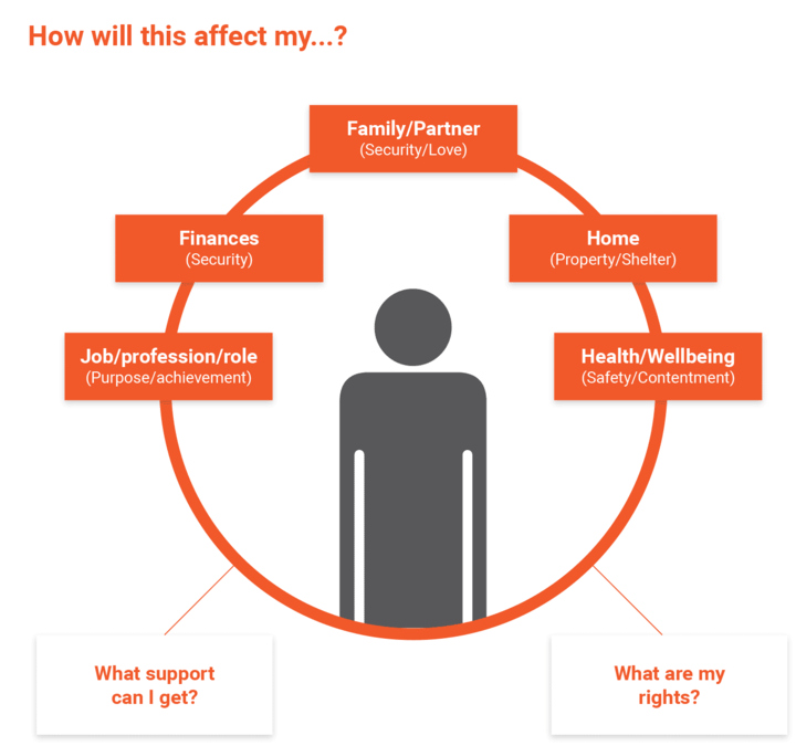
For the prototype we have sub-categorised content into 5 areas:
- Family/Partner
- Home
- Health/Wellbeing
- Finances
- Profession/role
Selecting any of these links will show a page with the same treatment regarding that particular life event, but will drop any other related life events to the bottom of the content (recognising that the user has chosen to go down the path of one particular life event).
View our full prototype presentation.
Where we go next
As this is just a simple prototype we have a long way to go before we could implement the life events model into our site. We’re taking the prototype to users to gather their feedback – firstly to test that the life events model is an acceptable way to theme and organise content, then to test our design assumptions.
Our team highlighted several challenges through the creation of the prototype, including the difficulty of presenting information too early in the process, which can cause extra stress; showing a page about avoiding homelessness to a user who is investigating relationship breakdown may not be the correct approach and should be tested and strongly considered. Similarly, there are sensitivities around presenting information about leaving a partner when someone is only researching options or seeking support. We need to spend more time exploring how we can understand these needs and translate them into our interface.
We are also going to begin engaging with stakeholders from across the Scottish Government, public and third sectors to co-design and fact check before we commit to building an alpha. You can comment below or tweet us @mygovscot.

Leave a comment