Digital
Accessibility
December 20, 2016 by Jono Ellis No Comments | Category Digital Public Services, mygov.scot
This is a blog post by Scott Langley, our senior user experience designer.
We often get asked about our approach to accessibility so I’d thought I’d share a little on how we go about trying to make all our digital products as accessible as possible.
Accessible digital products benefit everyone
Accessibility is an important area and one which is often either overlooked or left as an afterthought when designing a website or piece of software. We feel that making a website accessible isn’t optional and should never be seen as a tickbox-exercise.
The number of working age citizens that have a disability is nearly one in five of the population – approximately 1 million people. Making websites accessible doesn’t just benefit disabled users, it benefits all web users.
The legal bit
The Equality Act 2010 is UK-wide legislation that covers accessibility and states that no one should be excluded from being able to use a service because of a disability. The Act doesn’t call for a website or service to comply to a specific standard but the Act has made it unlawful to discriminate against disabled users when providing any type of service. If your business has a website, it should be accessible to disabled users.
The types of disabilities addressed by the Act include:
- visual impairment
- motor and mobility issues
- hearing impairments
- cognitive issues
- learning disabilities
Our research shows that citizens usually suffer from a combination of disabilities.
Our Approach
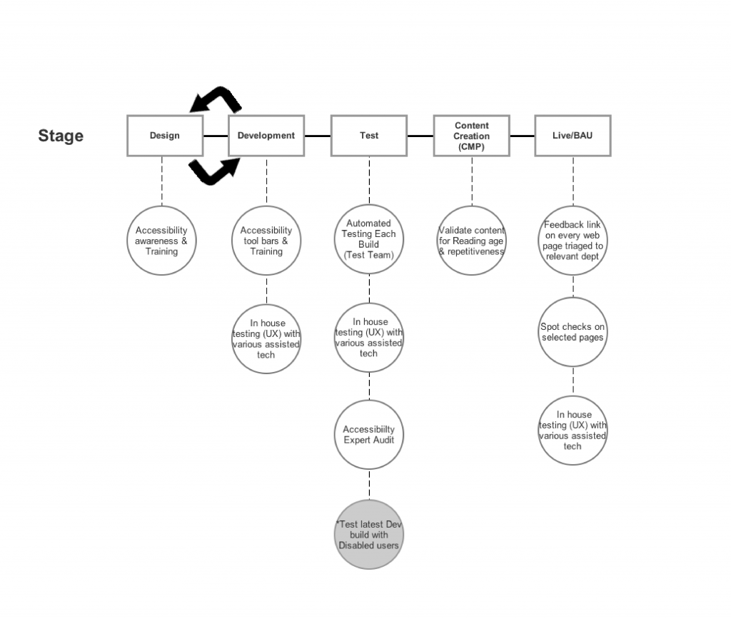
Early in the MyGov programme’s history, we realised the need for us to make accessibility a priority. It’s part of our entire team’s mindset due to the way we embedded accessibility into every part of our design and build process.
Stage 1 – Design
Accessibility is at the forefront; every design pattern or component that we design or redesign has accessibility baked in. We’re always thinking of ways to improve our designs. We always reflect on how real users interact with our digital products, from the size of a button on a mobile view or the contrast of a piece of text on a logo.
Stage 2 – Development
Awareness of how to make the digital products as accessible as possible comes from two things: knowledge and empathy. We’ve found that by involving our developers in our design process and showing our team screen captures and videos of real users using assistive technology in our usability testing sessions, we can consistently keep to accessibility best practice throughout our development process.
Developers test their code locally with various tools, so bugs affecting accessibility are caught early. The UX team further test the code with various assistive technologies when code changes become available in a shared development environment. Again, issues spotted here can be fixed before any real users are exposed to them. here are a few examples
- Wave Evaluation toolbar
- Quick Javascript Switcher
- Color Contrast Checker
- W3C Markup Validation Service
Stage 3 – Test
A large proportion of bugs and issues will have already been discovered in the design and development stages but the testing doesn’t stop there! In test, we run our websites through a series of automated tests. Currently, we use Pa11y and Tenon. We find these tests worthwhile in addition to our scripted tests as they can pick up around 30% of errors. If you are thinking about adding accessibility tools to your test process (and we recommend that you do) then check out this audit from our colleagues at GDS on how a variety of tools measure up.
The last part in testing – but arguably the most important – is user testing with users in their own home, using their own assistive technology setup. The feedback and information gained from observing users as they use your site or software are invaluable and is the most important part of our development lifecycle.
Stage 4 – Content Creation
Accessibility covers cognitive as well as physical disabilities. As the mygov.scot site is an informational, content-led site it’s crucial that users can both access the content via whatever assistive technology they’re using, and comprehend the content that they are reading. Our content is designed to be understood by anyone with an average reading age of 11 – we avoid the use of jargon words and words with multiple syllables, and write in Plain English. There are a variety of online tools that can help with this
- Hemingway app
- SMOG Calculator
Stage 5 – BAU
The process of ensuring accessibility doesn’t stop when content or features go live; we continue to spot check accessibility monthly. We also encourage users to get in touch via the feedback form on any page on our website if they’re having an issue or think there’s a way we could improve.
Making websites accessible never stops – we’ll never be finished and there’s always scope for improvement.
Further reading
Below are links to some great online resources to learn more:
- W3C Web Accessibility Initiative – Accessibility principles
- WebAIM (Web Accessibility In Mind)
- GOV.UK Accessibility
Please get in touch if you’d like to be involved with our user testing or to continue the discussion.


Leave a comment