Digital
SG payments project – Keep on collaborating
September 30, 2020 by Stewart Hamilton No Comments | Category Digital Public Services, Digital Scotland, Scottish Approach to Service Design
Blog by Fiona Maclellan, Senior Service Designer, Product and Commercial Division.
The SG payments project has taken a user-centred approach since it began in 2018. This has involved working closely with users through the Discovery phase, our Alpha build and as we prepare for our next phase. We recently posted about the project’s progress, and how we have begun building payment management software with the help of Scottish public sector organisations. We hope this software could eventually be used as a common, simpler way of managing payments across the public sector, as well as freeing up resource in Scottish public sector organisations to focus on front line service delivery rather than on building and running back office software.
This blog looks at how we have used the Scottish Approach to Service Design to :
• help define our processes and identify our users’ needs
• link up with the new Scottish Government Design System
How user needs drive our process
We know building a fully-functioning payments service means creating software that:
• stores and gives easy access to an up-to-date transaction record
• gives users of the software the key functionality they need to make payments smoothly
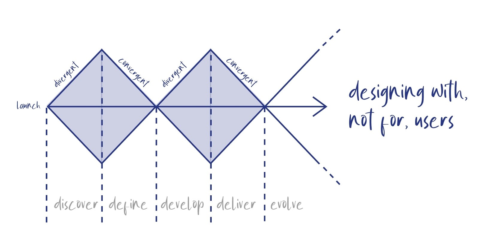
We decided the best way to make sure these key user needs are met, and our software is as simple to use as we want it to be, was to take a user-centred design approach, which is summarised in this diagram:

Using our Discovery phase insights as a springboard, we set out to include users in the designs we were producing during the Alpha phase of our project. Users played a role in:
• helping us prioritise the functionality we were looking to deliver
• designing wireframes
• testing the usability of prototypes across 3 design rounds
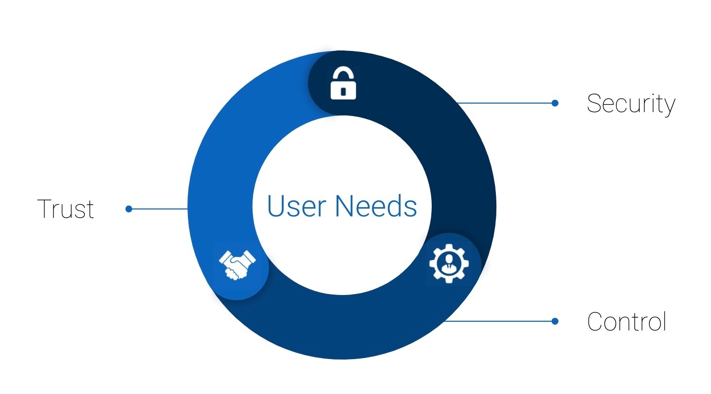
Our users have told us that trust, security and control are the three most important elements in a payments service. These 3 themes now sit at the core of what we have been building and testing:

Trust: users must feel confidence in a payments system (i.e. that the system is secure, well maintained, functioning properly and is reliable).
Security: when making and receiving payments, users identified safety as being key, in particular protecting transactions, data and safeguarding against fraud and ID theft/deception.
Control: users highlighted that a payments service has to be accessible, simple to use, clear and consistent
To help get the most from user-centred design, we’re designing our service using an iterative process. This means that we’re creating our service by moving through 4 stages:
• designing
• building
• testing with users
• listening to users’ feedback
Each time we finish these 4 stages we go through the stages again and include what we learned from the last cycle, until we’re confident we have a product ready to go live. This process doesn’t follow a straight line: it takes commitment from the project team, time for users and patience from stakeholders. But it’s in this process that we find the best way forward, helping build momentum with those who will use our service.
Scottish Government Design System
To help build trust and familiarity with users, we use the Scottish Government’s Design System to ensure a consistent Scottish Government look and feel to our service. Our home screen is a good example of us using Scottish Government patterns to create a consistent Scottish Government look and feel:

About the Design System
The Scottish Government created its design system to help the public sector design digital services. A design system keeps things simple for users by creating common user interfaces. This saves the public sector time and money by creating reusable building blocks that can be slotted into a service, rather than the organisation needing to design everything from scratch.
The Scottish Government Design System includes:
• pattern libraries, including code you can pick up and use for common website components, such as site headers and footers
• layout guides, including standard web page templates
• guidelines about the best fonts, font sizes and colours to use
• guidelines about image use that meet the latest accessibility regulations
The Scottish Government Design System is a work in progress and it is evolving as we continue to build our payments service. Recently, the Design System team shared where they are up to, and you can find out more in their blog post. We’ve found it an invaluable guide.
What’s next?
During the Alpha phase, we were lucky enough to partner with 3 organisations. Our ability to scope out the needs of users with these organisations has been fundamental to the Alpha design process – without them we would have been basing far too much on our own assumptions. Moving forward, we will be working with the same 3 partners, and hope to use the Alpha prototype to help us develop other parts of our service, including onboarding material and planning the types of support we’ll need to offer users. We’ll talk about this more in our next update, when we introduce our growing team and our ambitious plans for Beta.
If you have any questions or comment feel free to post below or get in touch with us directly: SGPaymentService@gov.scot
Tags: digital, digital public services, digital sector, digital transformation, platforms, ScotPayments, service design, SGPayments, user centred design

Leave a comment